A strategy chart is a visual tool that shows your organization’s goals and how they connect to each other. It helps you see the big picture of your business plan on a single page. Strategy charts turn complex business strategies into clear, visual plans that make it easier for teams to understand their goals and take action.

Many organizations struggle to communicate their strategy in a way that everyone can understand. Long reports and presentations often leave employees confused about how their work connects to company goals. A strategy chart solves this problem by mapping out objectives, showing relationships between different parts of your strategy, and making it simple to track progress.
This guide will walk you through what strategy charts are, how to build them, and how to use them effectively in your organization. You’ll learn about different types of charts, key components to include, and real examples of how businesses use these tools to align teams and drive results.
What Is a Strategy Chart?

A strategy chart gives you a structured framework to plan and execute campaigns by identifying concrete goals, targets, and tactics. It differs from visual strategy maps by focusing on actionable details rather than organizational objectives.
Definition and Purpose
A strategy chart is a planning tool that breaks down a campaign into specific components you need to win. It organizes your strategic planning into clear categories: goals, organizational resources, constituents, allies, opponents, targets, and tactics. Each element connects to help you build power and achieve concrete results.
The chart forces you to think through your campaign before jumping into action. You identify what you want, who can give it to you, and how you’ll pressure them to act. This prevents wasted time on familiar tactics that don’t support your actual goals.
Your goals in a strategy chart must be concrete wins from specific targets. They should solve real problems and represent what you truly want, not a compromise. Each target gets their own strategy because different decision makers require different approaches to move them.
Strategy Chart vs Strategy Map
Strategy maps are visual diagrams that show cause-and-effect relationships between organizational objectives. They connect strategic goals across different perspectives like financial performance and internal processes. These maps work well for businesses tracking balanced scorecards and long-term value creation.
Strategy charts focus on campaigns to change specific policies or stop harmful actions. You use them when you need to identify decision makers and build enough power to make them act. The chart lists opponents not to convince them but to anticipate their moves against you.
A strategy map answers “what are our objectives and how do they relate?” A strategy chart answers “who can give us what we want and how do we pressure them?” Maps visualize existing organizational strategy while charts plan tactical campaigns for concrete wins.
Key Benefits in Strategic Planning
Strategy charts keep your campaign organized and focused on winning. You avoid the trap of doing activities just because your group knows how to do them. Every tactic must support a strategy that moves a specific target.
The framework helps you identify small wins along the way to your main goal. These victories build confidence and energy in your group. Your campaign escalates over time instead of repeating the same ineffective actions month after month.
You assess your actual resources honestly rather than wishfully. This includes evaluating which allies have real power and which targets you can realistically move. The chart also requires a timeline with specific assignments: who will do what by when. This accountability keeps momentum going and people engaged in the work.
Core Components of a Strategy Chart

A strategy chart relies on three main building blocks that work together to create a clear picture of your organization’s direction. These components include your strategic goals and objectives, the metrics you’ll use to track progress, and the connections between different parts of your plan.
Strategic Goals and Objectives
Your strategic goals define what you want to achieve in the long term. These are broad statements about where you want your organization to go. Strategic objectives break these goals down into specific, actionable targets that your team can work toward.
You need to write your objectives in simple terms that everyone can understand. Each objective should suggest continuous improvement rather than a one-time task. A typical strategy chart includes 12 to 18 strategic objectives spread across different areas of your business.
Your objectives must connect to your organization’s mission and vision. They should answer questions about what you need to improve, what capabilities you need to build, and what results you expect to see. Good objectives are clear enough that any employee can see how their daily work contributes to achieving them.
Business Goals and Performance Metrics
Performance metrics tell you whether you’re making progress toward your business goals. These measurements track specific results and help you know if your strategy is working. Key performance indicators (KPIs) are the most important metrics that show success in critical areas.
You should pick metrics that directly relate to your objectives. Each strategic objective needs at least one KPI to measure it. Your metrics might track financial results, customer satisfaction, process efficiency, or employee capabilities depending on what you’re trying to achieve.
Good metrics are easy to measure and understand. They give you regular feedback so you can adjust your approach when needed. You can use numbers, percentages, or ratios to track your progress over time.
Cause-and-Effect Relationships
Cause-and-effect relationships show how your objectives connect and influence each other. These connections explain how improving one area of your business leads to better results in another area. You draw arrows between objectives to show these relationships on your strategy chart.
These links help you see how value flows through your organization. When you improve employee skills and tools, you can increase process efficiency. Better processes lead to shorter wait times for customers. Satisfied customers bring in more revenue.
Understanding these relationships helps you prioritize where to focus your efforts. You can identify which objectives will have the biggest impact on your overall success. Your team can also see how their work in one area supports progress in other parts of the organization.
Types of Strategy Charts and Maps
Strategy charts come in different formats to help you visualize your organization’s goals and actions. The Balanced Scorecard provides a framework for measuring performance across multiple business areas, while strategy map templates offer ready-to-use formats that you can customize for your specific needs.
Balanced Scorecard (BSC) and Perspectives
The Balanced Scorecard (BSC) works as a performance management framework that measures your organization’s success across four key perspectives. Robert Kaplan and David Norton developed this approach to help businesses track more than just financial results.
The BSC includes these four perspectives:
- Financial Perspective: Revenue growth, cost reduction, and profitability metrics
- Customer Perspective: Customer satisfaction, retention, and value delivery measures
- Internal Process Perspective: Operational efficiency and quality indicators
- Learning and Growth Perspective: Employee skills, knowledge systems, and organizational culture
Each perspective contains specific objectives and key performance indicators (KPIs) that connect to your overall strategy. The financial perspective answers how you create shareholder value. The customer perspective defines what makes your offering different from competitors. The internal process perspective identifies which operations need improvement. The learning and growth perspective shows what capabilities your team needs to develop.
Strategy Map Templates and Examples
Strategy map templates give you a starting point for creating your own visual strategy plan. These templates include pre-built frameworks that you can edit to match your organization’s goals.
Common template types include corporate-level maps, department-specific maps, and team-focused maps. A corporate template shows high-level objectives across all four BSC perspectives. Department templates like HR or marketing strategy maps break down how each team supports company goals. Product or regional templates help you align specific initiatives with broader objectives.
You can cascade templates from top-level strategy maps down to individual teams. This creates alignment between what your executives plan and what your front-line employees do daily. Templates also include arrows that show cause-and-effect relationships between objectives, making it easier to see how achieving one goal helps you reach another.
Designing and Creating a Strategy Chart
Strategy charts translate complex organizational goals into clear visual formats that teams can understand and act on. The design process involves defining objectives across key perspectives, selecting the right tools, and applying visual best practices to ensure clarity.
How to Make a Strategy Chart
Start by defining your mission and vision statements. These form the foundation of your strategy chart and explain why your organization exists and what it aims to achieve.
Next, analyze your environment by identifying stakeholders like customers, suppliers, and competitors. Use tools like stakeholder maps to understand who affects your strategy and how they relate to your organization.
Define your strategy by outlining activities that create a sustainable competitive advantage. This might involve delivering higher value to customers than competitors or improving operational efficiency.
Translate your strategy into a visual map by organizing objectives under four perspectives. The financial perspective includes revenue growth and cost reduction goals. The customer perspective defines your value proposition and how you serve customers. The internal process perspective highlights key processes needed to deliver value. The learning and growth perspective covers skills, knowledge, and systems your team needs.
Show cause-and-effect relationships by drawing arrows between connected objectives. For example, employee training improves internal processes, which then enhances customer satisfaction. Group related objectives vertically to highlight strategic themes like innovation or sustainability.
Tools and Strategy Map Makers
Digital tools simplify the process of creating and sharing strategy charts. Canva offers templates and drag-and-drop features that make strategy mapping accessible to teams without design experience.
Specialized strategy map makers like Creately provide templates built specifically for the four-perspective framework. These tools let you edit online, collaborate in real-time, and share maps with stakeholders.
Look for tools that support visual elements like shapes, arrows, and color coding. The ability to export your chart as a PDF or image makes it easier to present to executives and team members.
Choose tools that allow multiple users to edit simultaneously. This encourages input from different departments and creates more comprehensive strategies.
Best Practices for Visual Representation
Keep your strategy chart on a single page. This makes it easy to see how all objectives connect without scrolling through multiple documents.
Use consistent shapes for similar elements. Ovals typically represent objectives, while arrows show relationships between goals.
Apply color coding to distinguish between the four perspectives. This helps viewers quickly identify which objectives belong to financial, customer, process, or learning categories.
Limit the number of objectives to avoid clutter. Focus on 3-5 key goals per perspective rather than listing every possible initiative.
Make text concise and scannable. Use short phrases instead of complete sentences to describe each objective.
Position your most important objectives prominently. Financial goals often appear at the top, with supporting objectives flowing downward to show how lower-level actions drive higher-level results.
Test your chart with team members who weren’t involved in creating it. If they can’t understand the strategy quickly, simplify the layout or reduce the number of connections shown.
Integrating Strategy Charts into the Strategic Planning Process
Strategy charts work best when they connect directly to your organization’s planning activities and support alignment across all levels. Success depends on making sure your chart reflects real objectives, follows a clear process, and adapts to different team needs.
Aligning with Organizational Objectives
Your strategy chart must start with your organization’s core vision and mission. Without this connection, the chart becomes a decorative document rather than a useful tool.
Begin by identifying your top-level goals. These might include financial targets like revenue growth or cost reduction, customer goals like satisfaction improvements, or operational aims like process efficiency. Each objective on your chart should trace back to these fundamental aims.
Leadership involvement is required at this stage. When executives and key stakeholders participate in building the chart, they ensure it captures the real priorities. This participation also creates buy-in, which you need for successful implementation across teams.
Test your alignment by asking if each chart element supports at least one major organizational goal. If an objective on your chart stands alone without clear ties to your vision, remove it or revise it. Keep your chart focused on 5-8 major objectives per perspective to maintain clarity.
Strategic Planning Process Steps
Building your strategy chart follows a sequence that moves from broad goals to specific actions.
Step 1: Define your perspectives (financial, customer, internal process, and learning and growth). Each perspective addresses a different aspect of your organization’s performance.
Step 2: Set SMART objectives for each perspective. Make them specific, measurable, achievable, relevant, and time-bound.
Step 3: Map cause-and-effect relationships. Show how achieving one objective enables progress in another. For example, employee training (learning perspective) improves service delivery (internal process), which increases customer satisfaction (customer perspective), which drives revenue (financial perspective).
Step 4: Identify key performance indicators for each objective. Choose metrics you can track regularly and that truly measure progress.
Step 5: Assign owners to each objective. Someone must be responsible for driving results in each area.
Review your chart monthly or quarterly. Update it when business conditions change or when you achieve objectives and need to set new ones.
Cascading and Customization
Your organization-level strategy chart needs to flow down to departments and teams. This cascading ensures everyone understands how their work contributes to larger goals.
Create department-specific versions of your chart. A marketing team’s chart might emphasize customer acquisition objectives, while an operations team focuses on process efficiency. Both should link to the organization’s master chart.
Each team should have 3-5 objectives that directly support higher-level goals. Use the same format and perspectives to maintain consistency, but adjust the specific objectives and metrics to match team responsibilities.
Cascading Guidelines:
- Keep the same four perspectives at all levels
- Ensure lower-level objectives enable higher-level ones
- Use metrics appropriate to each team’s scope
- Review alignment quarterly
Customize your chart format based on your industry and size. A manufacturing company might weight internal processes more heavily, while a service business emphasizes customer perspectives. Small organizations might combine some perspectives, while large enterprises might add sub-categories within each perspective.
Applications and Examples Across Business Functions
Strategy charts help you visualize how different parts of your business connect to reach your goals. Sales teams use them to track customer relationships, operations teams optimize their processes, and executives monitor financial outcomes.
Strategy Charts for Sales and Marketing
You can use strategy charts to map out how your sales and marketing efforts connect to revenue growth. These charts show the relationship between customer acquisition activities and business outcomes.
A typical sales strategy map links objectives like “increase brand awareness” to “expand customer base” and finally to “grow revenue.” Your marketing team can track how social media engagement drives website visits, which then convert to sales leads. This visual approach helps you see which marketing channels produce the best results.
Key elements to include:
- Customer satisfaction metrics
- Lead generation targets
- Conversion rates
- Brand awareness goals
Sales strategy charts also help you identify where to invest your budget. If your chart shows that email campaigns drive more conversions than paid ads, you can shift resources accordingly. You can track multiple campaigns at once and see how they work together to achieve your sales targets.
Operational and Resource Optimization
Strategy charts guide how you use your company’s resources across different departments. You can map internal processes to show where improvements will have the biggest impact on your business goals.
Your operations team benefits from charts that link process efficiency to cost reduction. For example, you might map “reduce production errors” to “lower material waste” and then to “improve profit margins.” This shows everyone how their daily work connects to company success.
Common operational objectives include:
- Streamlining workflows
- Reducing cycle times
- Improving quality control
- Enhancing employee training
Resource allocation becomes clearer when you see all your business functions on one page. You can identify which processes need more staff or technology investments. The chart also reveals dependencies between departments, helping you coordinate improvements across teams.
Improving Shareholder Value
Strategy charts connect your operational activities directly to shareholder value creation. You map financial objectives at the top and show how customer satisfaction, internal processes, and employee development support those goals.
Your strategy map demonstrates to investors how you plan to increase profitability and growth. Financial objectives like “increase revenue by 15%” sit at the top, supported by customer objectives like “improve retention rates” and process objectives like “reduce operating costs.”
This approach makes it clear how every business function contributes to shareholder value. You can show investors that your customer service improvements aren’t just nice to have—they directly impact customer loyalty, which drives recurring revenue. Your strategy chart becomes a communication tool that explains your business logic to stakeholders.
Frequently Asked Questions
Strategy charts serve different purposes across various fields, from financial markets to social advocacy to gaming decisions. The following questions address specific applications and best practices for creating and using these visual planning tools.
How can one utilize a strategy chart for effective stock trading?
A strategy chart in stock trading helps you track price movements, identify trends, and make informed buy or sell decisions. You can use technical indicators like moving averages, support and resistance levels, and volume data to build your trading strategy chart.
Start by selecting the timeframe that matches your trading style. Day traders typically use 5-minute or 15-minute charts, while swing traders prefer daily or weekly views.
Add key technical indicators that align with your strategy. Common choices include the Relative Strength Index (RSI), Moving Average Convergence Divergence (MACD), and Bollinger Bands.
Mark critical price levels where you plan to enter or exit positions. These levels should be based on historical price action and your risk tolerance.
What are the key components of a cryptocurrency trading strategy chart?
Cryptocurrency strategy charts require specific elements due to the volatile nature of digital assets. You need to include 24/7 price data since crypto markets never close, unlike traditional stock exchanges.
Volume indicators are especially important in crypto trading. They help you identify genuine price movements versus manipulation or low-liquidity pumps.
Your chart should display multiple exchanges if you trade across platforms. Price differences between exchanges can create arbitrage opportunities or signal where the market is heading.
Include whale alert indicators or large transaction markers. These show when significant amounts of cryptocurrency move, which often precedes major price changes.
Set up volatility bands wider than you would for traditional assets. Cryptocurrencies can move 10-20% in a single day, so your chart needs to accommodate these swings.
What strategies do the Midwest Academy Strategy Chart suggest for advocacy campaigns?
The Midwest Academy Strategy Chart breaks down advocacy campaigns into specific actionable components. This tool helps you identify your goals, organizational capacity, and the targets who have the power to make your desired changes.
You start by defining your specific issue and what concrete change you want to achieve. Vague goals like “raise awareness” get replaced with measurable outcomes like “pass city ordinance 123.”
The chart requires you to identify your constituencies. These are the people directly affected by the issue who will support and participate in your campaign.
You must list your organizational resources honestly. This includes money, staff time, volunteers, and any existing relationships with decision-makers or media.
Target identification is crucial. You need to determine exactly who has the power to give you what you want, not just who you’re angry at.
The chart helps you develop tactics that put pressure on your targets while building your base. These tactics should match your resources and escalate strategically over time.
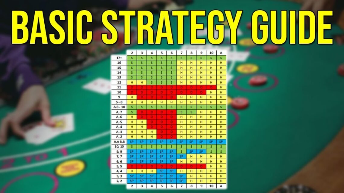
How does a strategy chart aid in making decisions in blackjack?
A blackjack strategy chart shows you the mathematically optimal play for every possible hand combination. You reference your cards and the dealer’s up card to find the correct action.
The chart divides decisions into four main actions: hit, stand, double down, and split. Following the chart reduces the house edge to around 0.5% in most games.
Hard hands (no ace or ace counted as one) follow different rules than soft hands (ace counted as eleven). The chart displays these separately so you can quickly find your situation.
Pair splitting has its own section. The chart tells you which pairs to split based on what the dealer shows, since some splits are profitable while others lose money faster.
You need to memorize the chart for casino play since most establishments don’t allow reference materials at the table. Start with the most common situations and gradually learn the exceptions.
What constitutes the best practices for creating a versatile strategy chart?
Start by clearly defining what decision or process your chart will support. A focused purpose prevents your chart from becoming cluttered with unnecessary information.
Use consistent visual elements throughout your chart. Shapes, colors, and connectors should have the same meaning each time they appear.
Organize information hierarchically with the most important elements prominently displayed. Your eyes should naturally move through the chart in a logical sequence.
Keep text minimal and specific. Each label or description should convey essential information without requiring interpretation.
Test your chart with potential users before finalizing it. Watch where they get confused or ask questions, then refine those areas.
Include a legend or key when you use symbols, colors, or abbreviations. Users shouldn’t have to guess what elements mean.
Make your chart scalable for different contexts. It should work whether you’re viewing it on a phone screen or printing it as a poster.
Update your chart regularly as situations change. An outdated strategy chart causes more problems than having no chart at all.
Are there any recommended tools or software for developing an effective strategy chart?
Canva offers free strategy chart templates with drag-and-drop functionality. You can customize colors, shapes, and text without design experience.
Microsoft Visio provides professional diagramming tools for complex strategy charts. It integrates with other Microsoft Office products and supports team collaboration.
Lucidchart works entirely in your browser and allows real-time collaboration. Multiple team members can edit the same strategy chart simultaneously.
Miro combines whiteboarding with strategy mapping tools. It’s particularly useful for workshops where you’re building strategy charts as a group.
For trading strategy charts, TradingView is the industry standard. It provides extensive technical analysis tools and lets you save multiple chart layouts.
Creately specializes in strategy maps and offers frameworks specifically for business strategy charts. It includes templates based on the Balanced Scorecard methodology.
Google Slides or PowerPoint work for simple strategy charts. These tools are accessible to most users and don’t require learning new software.
Pen and paper remain effective for initial strategy chart drafts. Physical sketching often leads to better ideas before you commit to digital formats.